Estate Intel Design System
Creating a Design System to optimise user experience and brand consistency
Role Product Designer
I was responsible for creating and maintaining end-to-end design processes, conducting research, and translating findings into functional user interfaces.
Challenge
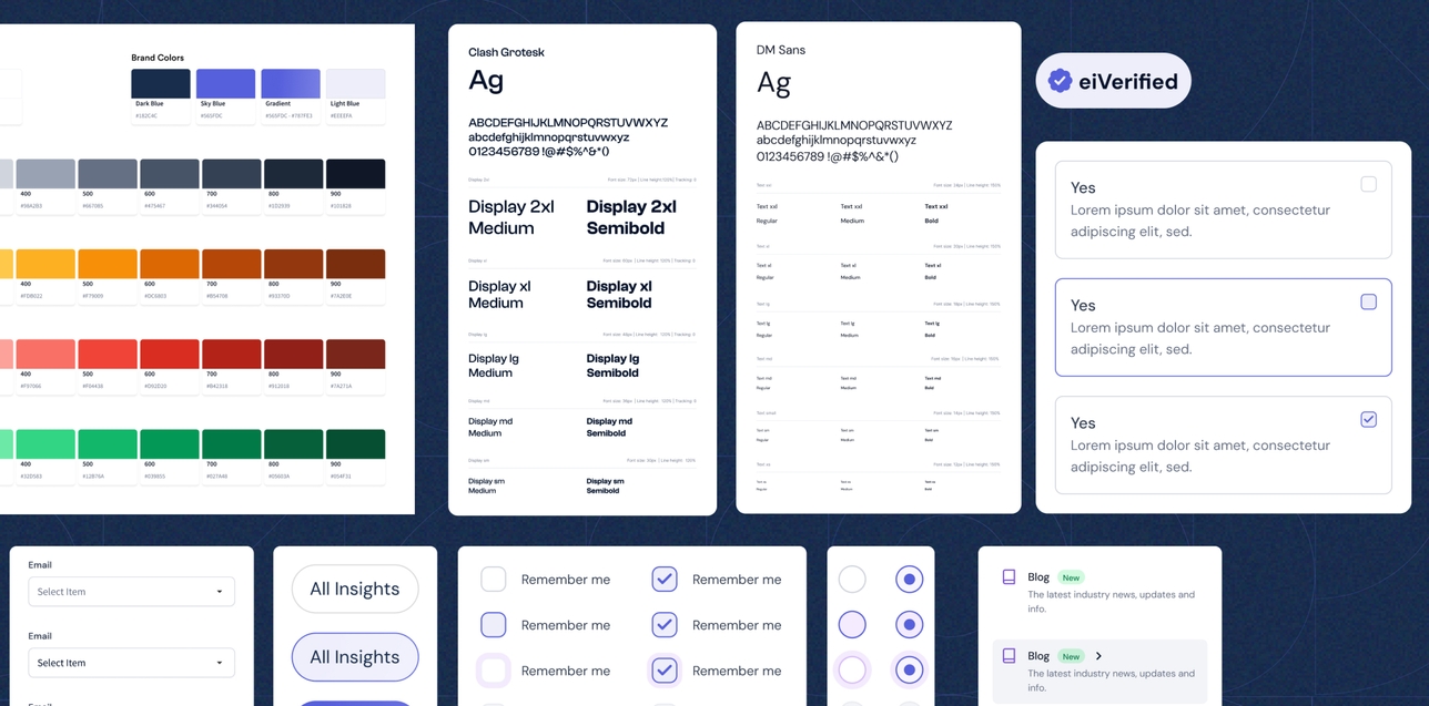
Upon joining Estate Intel, maintaining a cohesive and user-friendly experience across all our platforms and branded materials was my priority. There were discrepancies between elements such as our social media presence, website design, and other branded materials, which affected the aesthetic appeal and also led to confusion among users, diminishing the overall brand identity.
We had multiple components that did the same thing but looked different, which had been designed and developed by different designers and engineers. The team was growing, new engineers were joining, and new designs needed to be delivered for our new products. It was crucial to address these inconsistencies promptly to ensure that we maintained a professional and unified image across all touchpoints.
We had multiple components that did the same thing but looked different, which had been designed and developed by different designers and engineers. The team was growing, new engineers were joining, and new designs needed to be delivered for our new products. It was crucial to address these inconsistencies promptly to ensure that we maintained a professional and unified image across all touchpoints.
Goals
For the issues identified, there needs to be a mutually accessible file where we can draw design references from. Here are the goals we hoped to achieve:
- Give the website a unique style and distinguish it from the existing brand.
- Create a unified language and ensure a consistent experience throughout our products.
- Update and unify inconsistent components
- Document the design system as it was being designed.d
Foundation
Setting the foundation was key to the overall construction of the design system. A few things to put in place were colors, typography, spacing, and icons. This would set the tone for the overall design. I leaned more toward adaptation than adoption (because I wanted more control and customization) or creating from scratch (because it is costly and time-consuming).
Colours
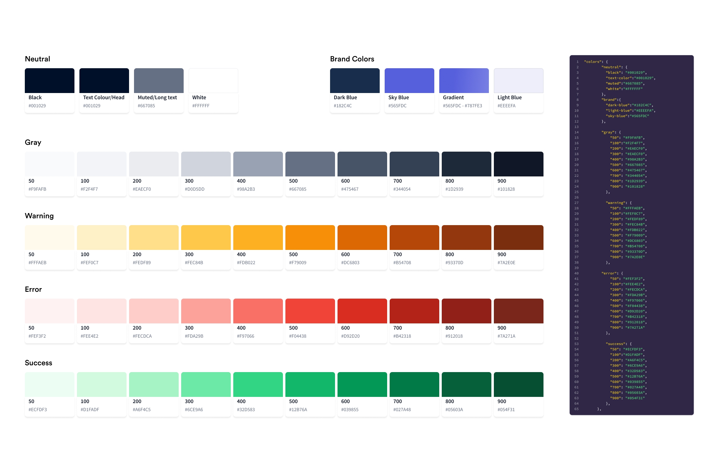
I started with the current brand colours as they were going to be retained, other colour categories like primary colours and neutral colours accompanied it. My team uses Tailwind so I wrote out the colour utilities to make hand-off easier.
Typography
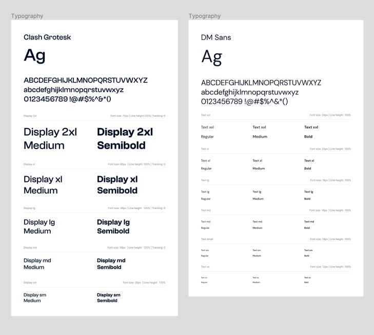
At Estate Intel, we incorporated 2 typefaces all around our products to make them stand out. We formerly used Circular Std which was used by a very popular brand.
- Body (DM Sans)
- Headers (Clash Grotesk)
The font scale was adopted from Tailwinds font sizing. They are well constructed and have consistent spacing between them
Components
I settled on adapting components from an existing library, reducing the time to develop the design system.
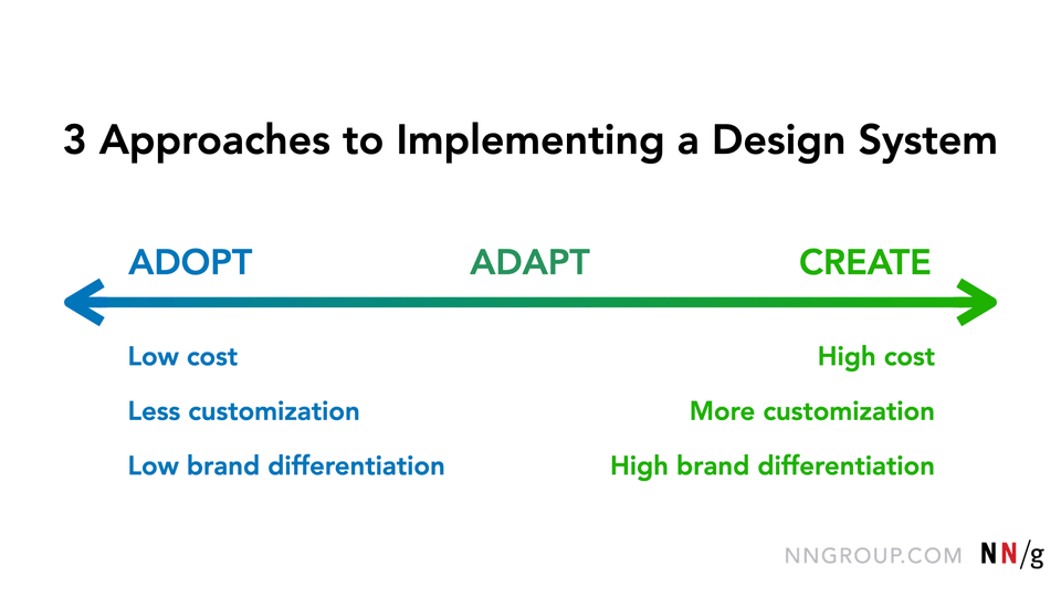
Some of the design elements I picked up are:
Buttons
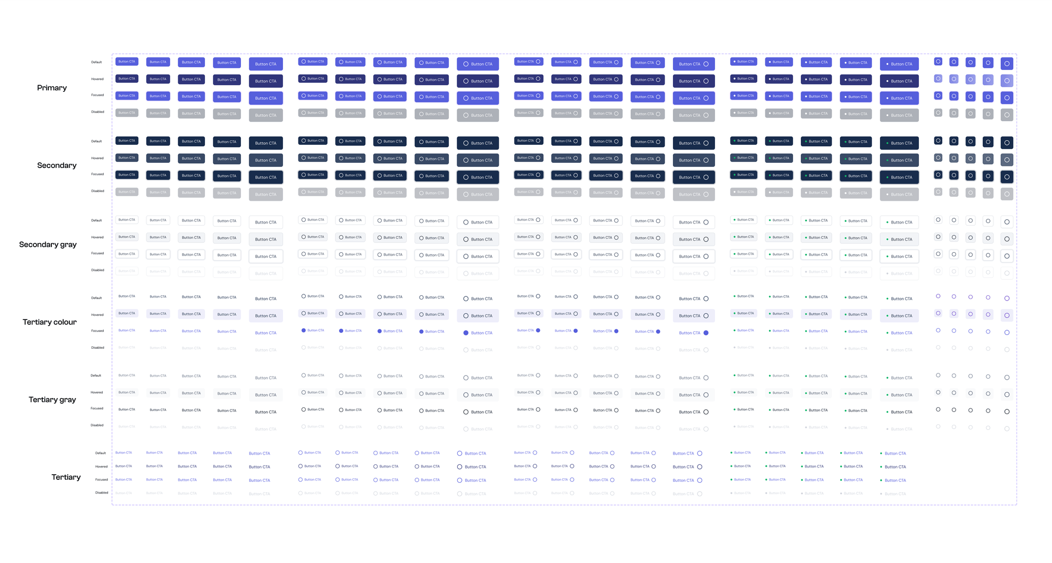
Input Fields

While picking from an already existing library saves resources, some custom components are designed to fit our product requirements. This includes:
- Tooltip
- Badges
- Cards
- Navigation bar
- File Upload
- Footer
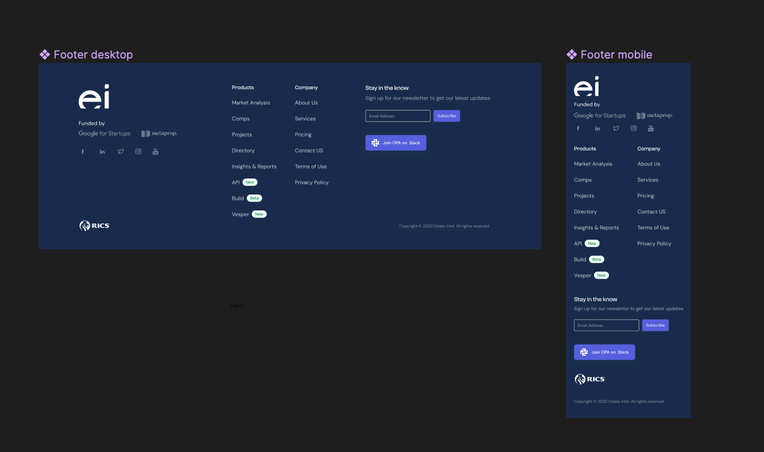
Documentation and Usage
All of the designs were done on a new Figma file, editable by only specific people. The components were published in the team file so the design system file could be imported into any design file when they were needed. This allowed me to easily retrieve instances of components when needed.
Results Achieved
- Consisitency: I achieved a unified system that ensures consistency across all elements of our product, including colors, typography, spacing, and UI components. This consistency helps to create a cohesive user experience, making it easier for users to navigate and understand the product, reinforcing our brand identity by adhering to a consistent design language.
- Scalability: As our product evolves and grows, new features easily adopt the existing design patterns and components, ensuring continuity and reducing the need for extensive redesign or development work.
- Enhanced Collaboration and Continuity: If we hire a new designer or contract a designer, establishing a shared language and set of standards, we can work more efficiently together, reducing misunderstandings and streamlining the feedback and iteration process.
- Efficiency and Quicker Iterations The design systems streamlined our design and development process by almost 50%, providing reusable components and guidelines, leveraging predefined components and styles from the design system.
