Pricing Page
Creating the pricing page of Africa’s largest real estate database
Role Product Designer
I was responsible for creating and maintaining end-to-end design processes, conducting research, and translating findings into functional user interfaces.
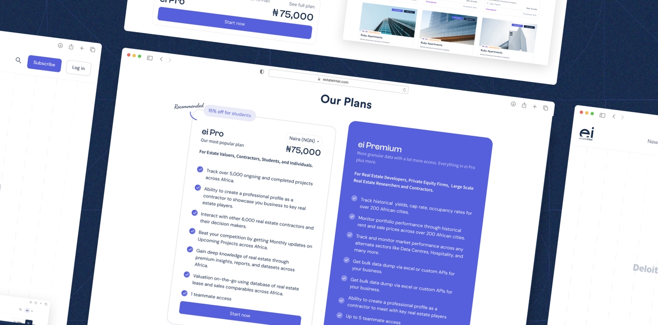
Introduction
A good number of potential users found it difficult to understand what we do at Estate Intel. We simply provide data for the most ambitious real estate businesses looking to position their investment.
It’s difficult to make payment for something you don’t know you need. This was the story of the pricing page, as it had a lot of drop-offs.
The Problem
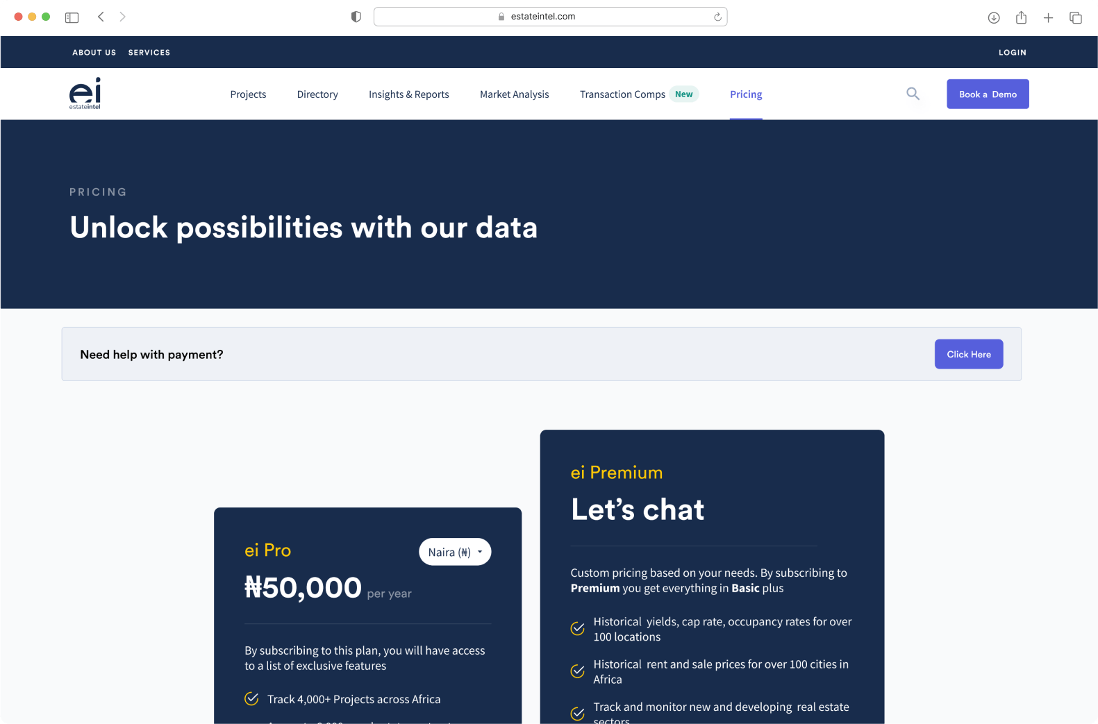
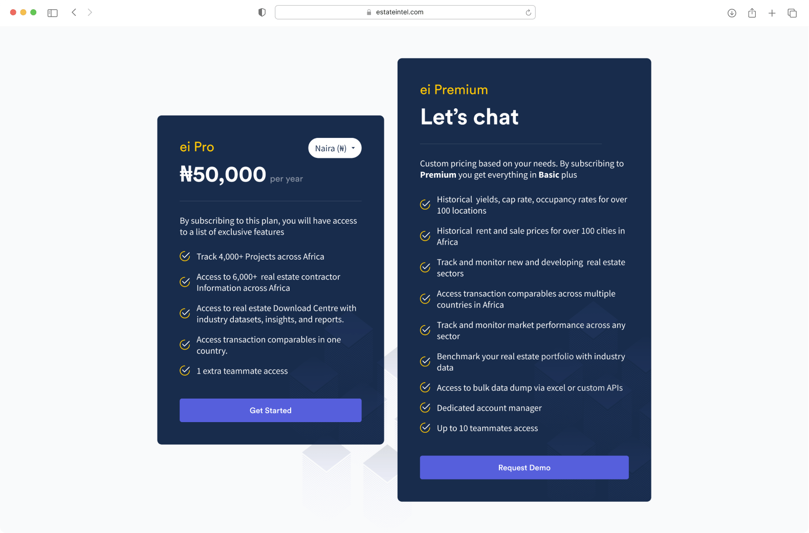
We identified a couple of problems through user feedback and watching users engage with the pricing page so of them includes:
- Users do not fully understand what they were paying for
- The features were not well explained and the pricing tiers were cumbersome
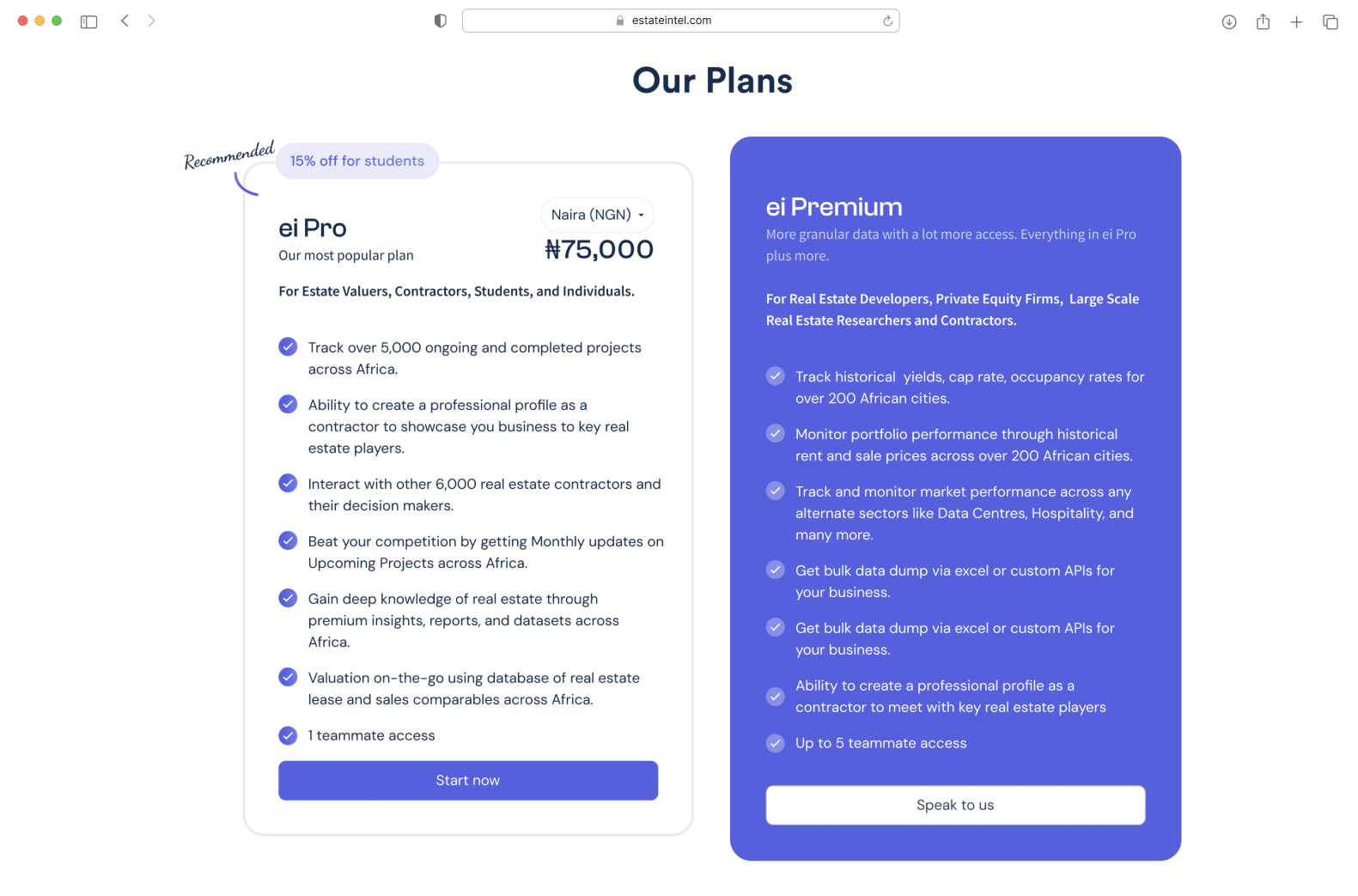
- No good direction on which plans were for who
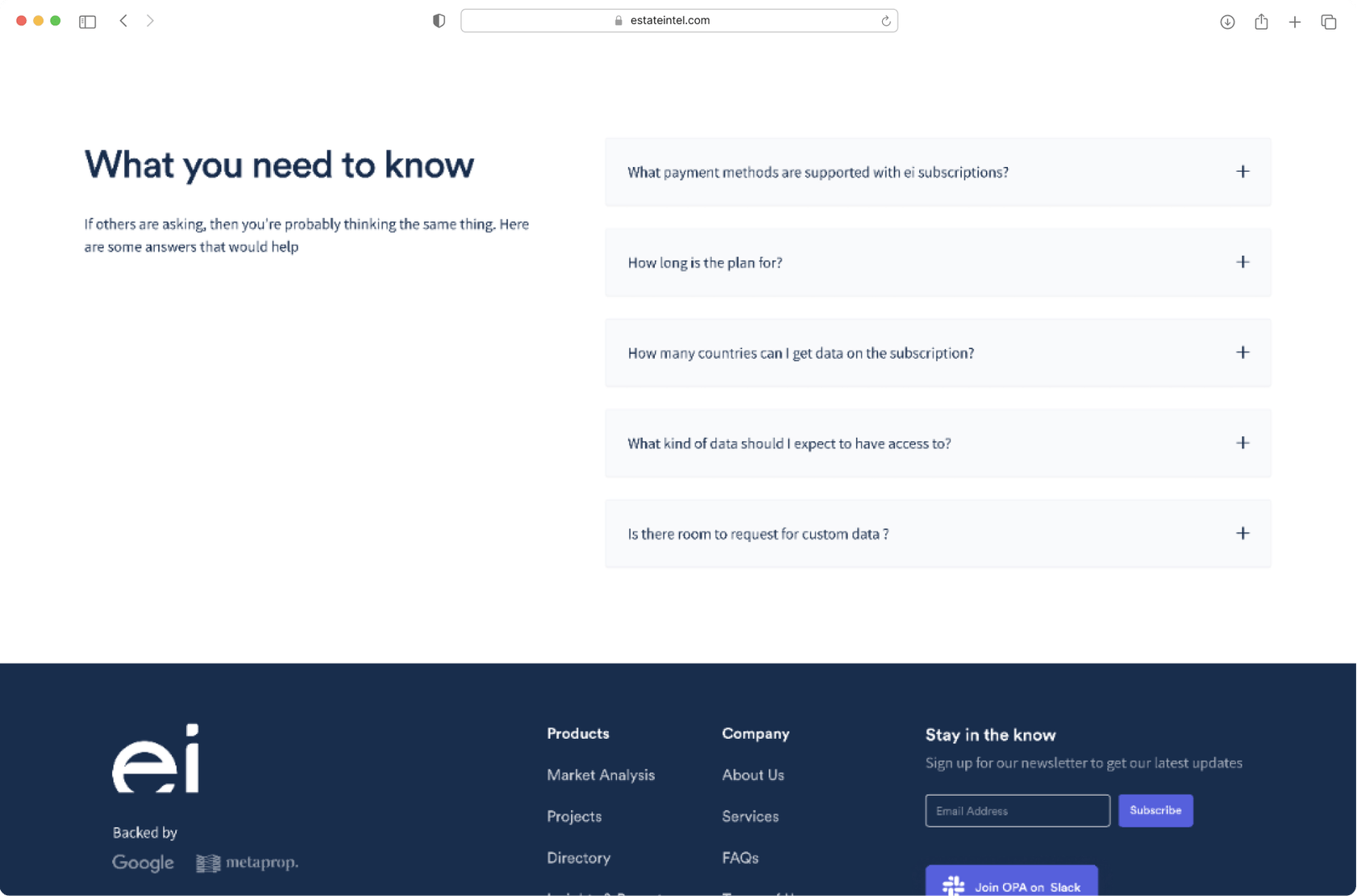
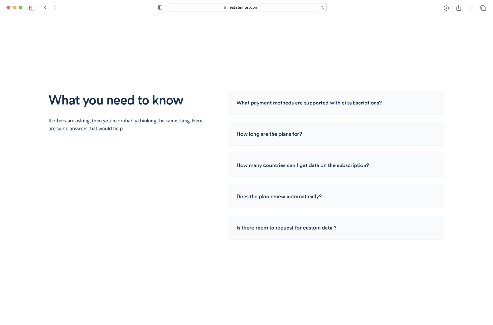
- No FAQs to easily solve quick bottleneck problems
The Solution
After gathering feedback from clients and stakeholders, we decided to prioritise simplicity and clarity in the whole design process trying to spell it out and avoiding professional jargon.
First Iteration
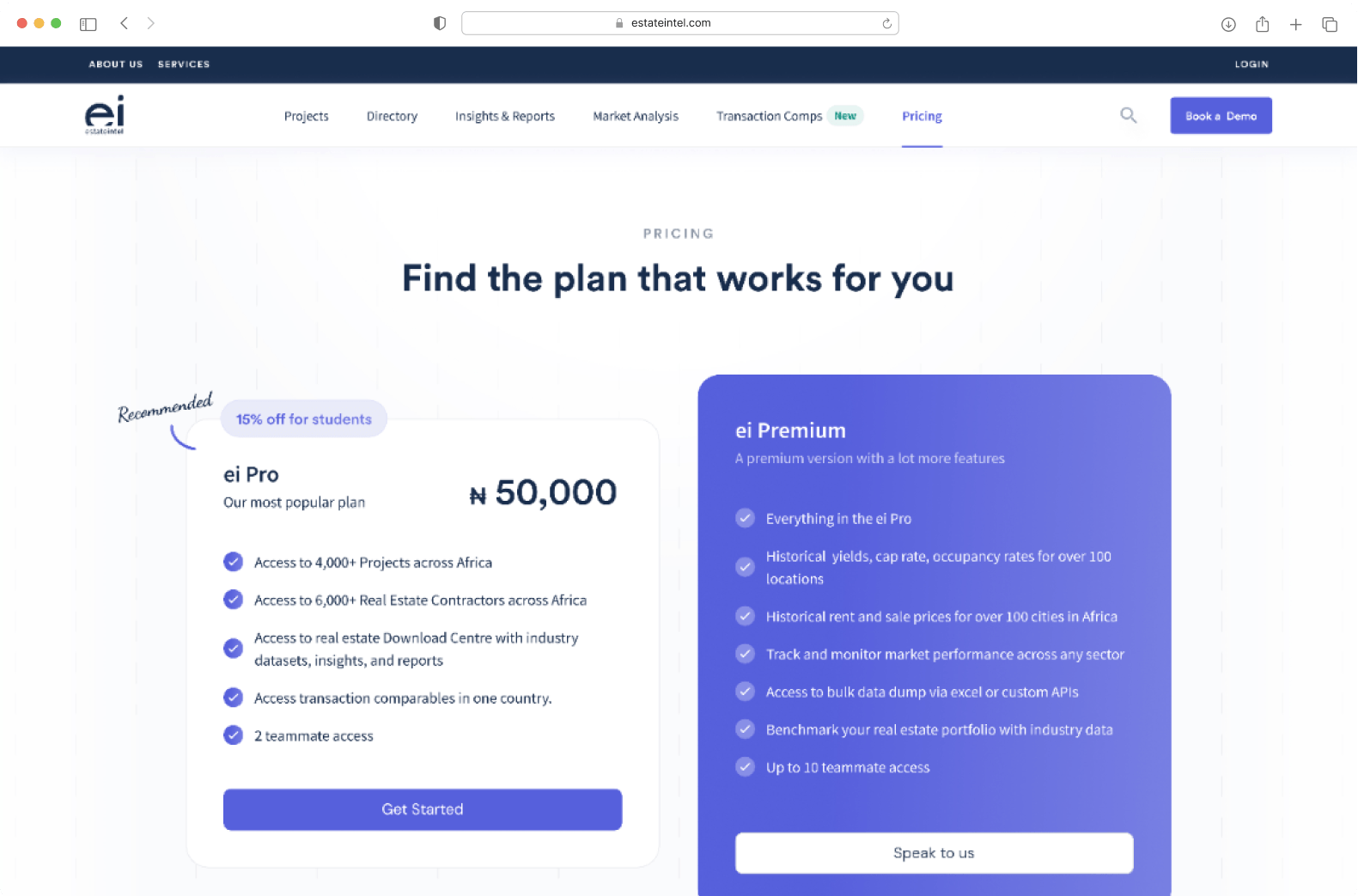
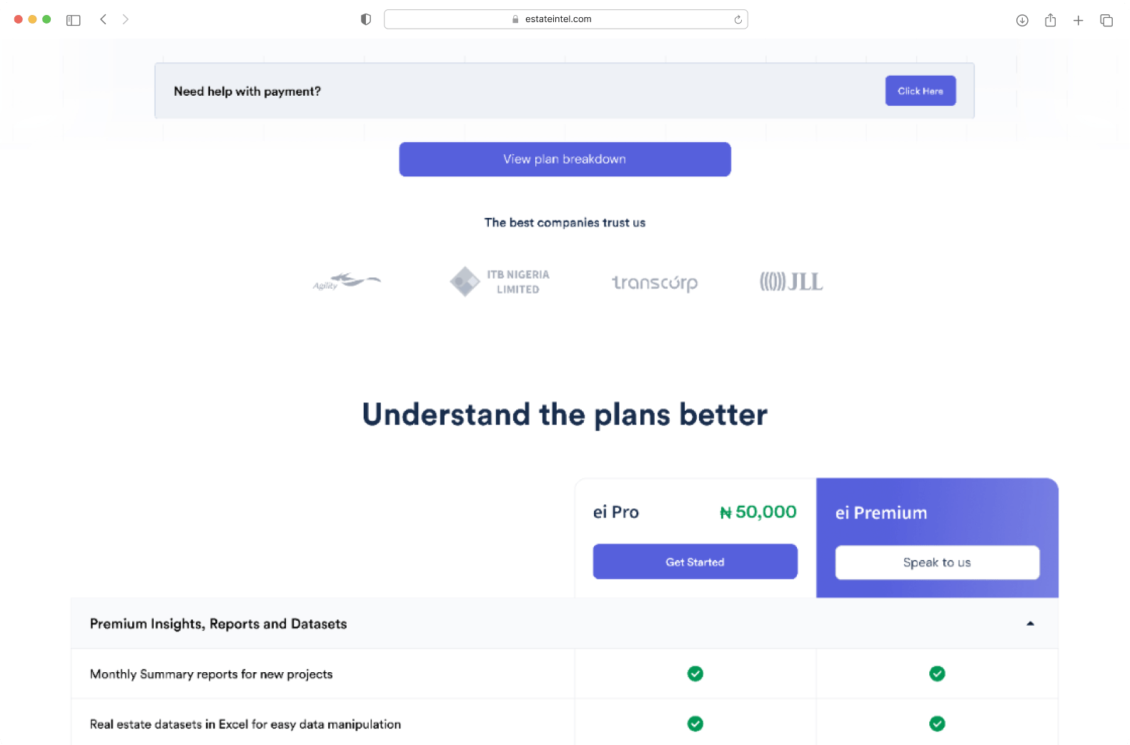
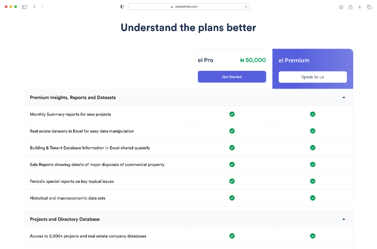
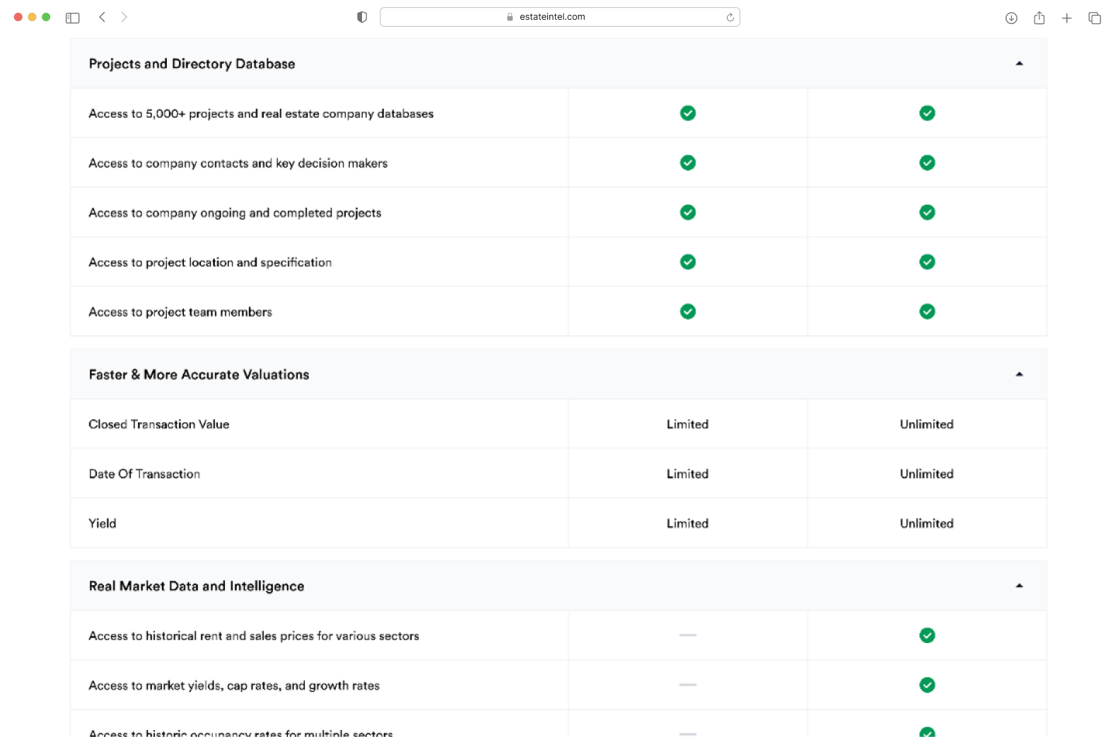
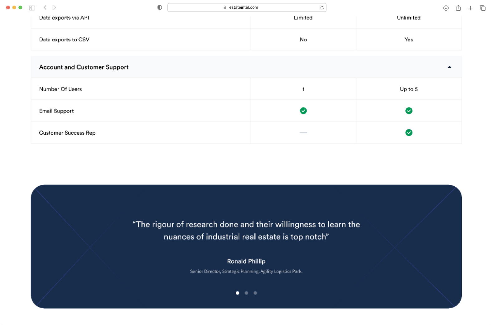
In the first iteration, we tried to solve the problem by ticking the boxes and adding what was missing. We made the page more visually appealing, which brought us one step closer to the solution. However, we received feedback from our stakeholders that we had included too much text, which made the decision-making process tedious.
Second Iteration
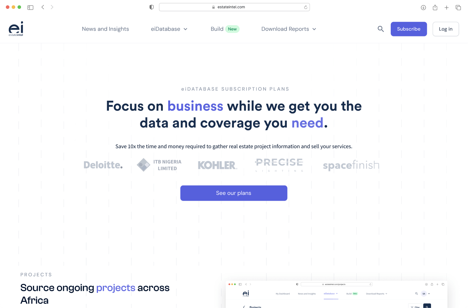
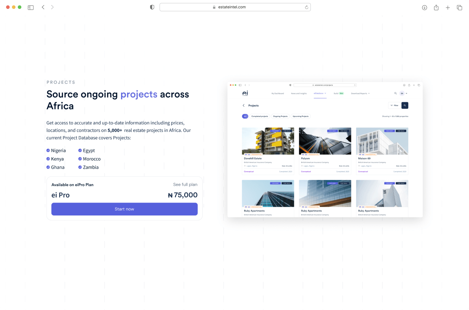
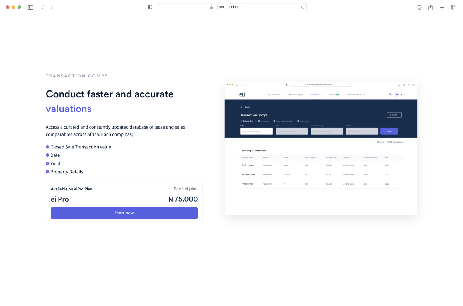
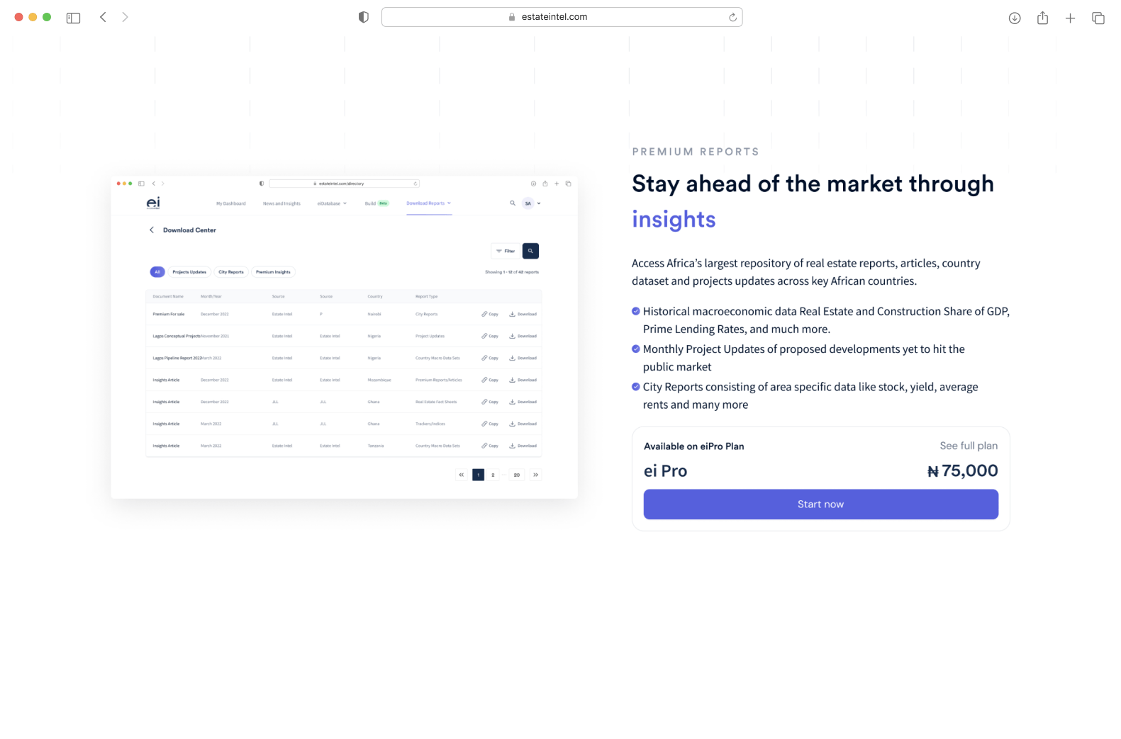
In the second iteration, I focused on simplifying the text and making it more concise. I also provided clear explanations for each feature and pricing tier and direct users to the plan that suits their needs. Additionally, we will include FAQs to help users quickly solve any issues they encounter. I believe that these changes will make our pricing page more user-friendly and increase conversions.
Results Achieved
- We achieved a clear and concise pricing page with less confusion about our services
- Since moving to the subscription model for our platform it generated NGN10million in revenue
